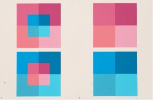
According to Josef Albers, innovative painter, sculptor, teacher, poet, and pioneer of art theory, “color is the most relative medium in art.” Since colors are always seen side by side, relative to one another, our perception of how we see one color can change drastically depending on its context. The interpretation of color is less about choosing one color – it’s about the interaction of color. This phenomenon is called simultaneous contrast, and it can act as a cornerstone in developing your brand’s color identity by looking at colors as a whole, rather than individually.


So, how do you begin to determine what kind of color scheme is the fit for your brand? Let’s dive into three different types of color schemes as a starting point for determining the colors you could be using.
- Complementary Colors
Complementary colors are a classic – they are opposites of each other on the color wheel. These were probably some of the first color combinations you learned about in school growing up. Red and green; yellow and purple; orange and blue. Choosing complementary colors gives a high-contrast, loud, bold look, perfect for lively, exciting brands (think soft drinks and sports teams). Complementary colors stand out in today’s landscape of brands, which tend to opt for more muted, simple, toned-down, colors – if you’re a fan of retro design, this is for you! To soften the look, opt for a split complementary color scheme, which uses two colors across the color wheel, with those two colors lying on either side of the complementary color.
2. Monochromatic Colors
A monochromatic color scheme means incorporating the various tints, shades, and tones of a single hue, with usually 3-7 variations. Depending on the color you choose, your brand could be vibrant and fun or upscale and calm – or somewhere in between. Overall, choosing a single color as your brand’s identity creates a simple, cohesive look without the influence of other hues. Additionally, choosing a monochromatic color scheme will make your audience immediately associate that color with your brand and make your products instantly recognizable. Monochromatic color schemes have become popular in recent years and can give your brand a modern, sleek appearance.
3. Gradient Colors
Using gradients in design is another current, popular trend. By blending the colors together, there is much less of a contrast between the colors and the way they interact becomes less straightforward and harsh. Incorporating gradients into your brand’s identity can create a dynamic look, evoking movement, connectivity, and fluidity. Choosing colors that are close to each other on the color wheel (like red, orange, and yellow) can send a soothing message to your audience. But, gradients also give the opportunity for colors that wouldn’t otherwise work together to exist cohesively for a look that is energetic and unique. Since this is such a popular trend, choosing gradients for your brand can be a great way to connect with a younger audience and is an option to consider for consumer and lifestyle brands.
These three examples of different types of color schemes are only the tip of the iceberg – there are endless possibilities for how colors can interact with each other. Even these three color schemes can be leveraged to elicit a wide range of feelings and associations. Not only is it important to decide the type of color scheme you want to use, but the colors that go within it and what emotions they are tied to (blue can be calming, red can be exciting, purple can be mysterious, and so on).
The best way to find the right color combination for your brand is to experiment. You’ll be sure to find color interactions that surprise you and how one color can look completely different depending on the other color(s) it’s paired with. Play around with different colors, see how they interact with each other, and find the right combination that tells your brand’s story.


