Figma is a powerful, collaborative web-based design tool for user interface and user experience designers. With a properly set up Figma file, you can create stunning production-ready web designs that can be passed on to your developer and coded into a live web environment.
This article will take you through the basics of setting up a Figma file for web design, from creating an account to configuring universal styles that will keep your designs consistent and easy-to-edit.
1. Getting Started
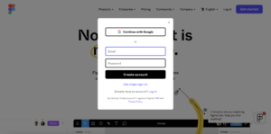
To begin using Figma, you’ll need to create an account. Click Get Started and enter your information or continue with Google to create an account. Once you’ve clicked Create Account, check your email inbox to verify your email address.
There are two ways to use Figma — you can either download the desktop app here, or you can use the web-based version in a browser such as Chrome, Safari, or Microsoft Edge.
Once you’re in Figma, you’ll be prompted to choose a name for your design team, invite collaborators, and select a plan that fits your needs.
Below is an overview of the Figma interface:
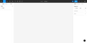
The dark grey bar at the top of your screen is the main menu — this is where you can switch between tools like Frames, Shapes, Pen (for drawing custom vector-based shapes), Text, Comments, and more.
Below the main menu on the left is the layers panel, which is organized by page. Below the main menu on the right is the design panel, which is where you’ll be able to edit elements like text style, color, and more.
2. Setting Up Frames
To begin designing a web page, you’ll need to create a frame. In a nutshell, one frame will represent one web page — this means that the size (in pixels) of your frame should match the resolution of a standard web page based on the device it will be viewed on. We recommend the following sizes depending on your specific device requirements:
- Desktop – 1440px
- Tablet – 768px
- Mobile – 375px
To create a frame, click the Frame tool in the main menu. Then click on the canvas and drag the frame to the desired width. The height of your frame will depend on how much content will be on the page, and can be adjusted later.
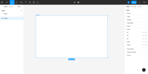
The name of your new frame (Frame 1) will appear on the left in the layers panel. We recommend re-naming the frame with the name of the page you are designing to help keep your file organized.
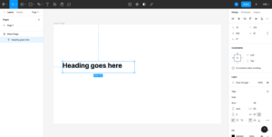
As you continue to add design elements to your page, make sure those elements are actually placed within the frame, as elements that are not placed in the frame may be lost when exporting a design. An element that has been successfully placed into a frame will appear indented directly under the name of your frame in the layers panel.
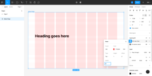
3. Configuring a Layout Grid
Layout grids are an extremely helpful way to set up a page design to make sure everything is spaced consistently, and in a way that can be easily coded by a developer.
To get started with a Layout grid, select a page frame. Under the design panel, click the + next to Layout grid. Then, click on the 9 small squares to open up the Layout grid settings and change Grid to Columns.

Columns will help ensure that your page margins are consistent, and that any columns you create to help organize page content are evenly spaced throughout your design. We recommend starting with the following Column settings and adjusting as needed for your specific project:
- Margin size: 80-100px for desktop, 20-30px for mobile
- Number of columns: 8-12 for desktop, 2-3 for mobile
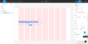
Once your columns are configured to your liking, click the + to the right of the Layout grid to create a second grid, which this time will be used to configure Rows. Open the grid settings by clicking the 9 small squares, and change Grid to Rows.
Rows will help to ensure that the vertical padding between your modules is consistent throughout, and can also be used to help standardize the height of certain elements such as images, text boxes, or buttons. We recommend starting with the following Row settings and adjusting as needed for your specific project:
- Type: Top (this will start the row count at the top of your page)
- Count: 100 (this will add 100 rows – adjust as needed for longer pages)
- Height: 1px
- Gutter: 8px
As you continue to add design elements to pages, like text boxes and images, make sure the widths and heights of those elements line up with your Layout grid.
Note: Layout grids will not show in exports and can be toggled on or off while you are designing by clicking the eye icons.
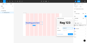
4. Adding Color and Text Styles
Color styles and Text styles make it easy to set up universal color palettes and typography hierarchies across your Figma file.
Let’s say you have colored a headline blue, and would like to add that specific blue to your Color styles. Click on the blue headline, and in the design panel click the four dots to the right of Fill. Then, click the + that opens up below the four dots to create a new color style.
A small window will pop up that says ‘Create new color style’. Write in a name for your color style, and click the Create style button. Now, whenever you click the four dots next to fill, your added color style(s) will appear for easy selection. Repeat this process to add additional colors to your color style.
Creating a Text style is very similar to creating a color style. With your text box selected, click the four dots to the right of Text, then click the plus to create a new text style. You can also click Show more options to make styling modifications to the text style before creating the style.
5. Creating Components
Somewhat like Color and Text styles, Components are a way to create a universally editable element that you can reuse across multiple pages, such as a navigation menu or a footer.
Let’s say you’ve designed a navigation menu for your page that includes a logo, navigation items, and a CTA button. To turn your navigation design into a Component, click all of the elements that should be included in the navigation. Then, right click and select Create component.
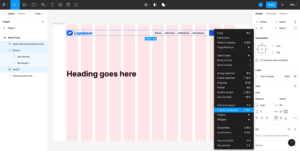
You now have a component that can be duplicated and used throughout all of your pages and edited in a single place. If you wish to make edits to your component, you will need to edit the original component — doing so will apply the edit(s) to all duplicates of that component, saving you time on manually updating multiple designs.
And just like that, you’re ready to begin designing your web pages! You now have a well-organized Figma file that will help keep your designs consistent, evenly spaced, and easily editable.